What's Changing in Google Ads
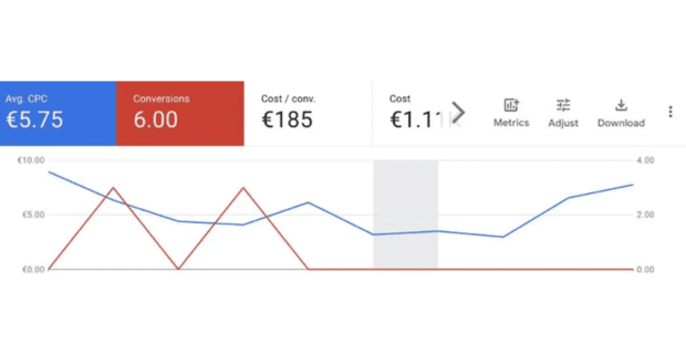
Traditionally, the metrics selectors in Google Ads lived above the performance graphs, giving users a wide visual space to analyze data. In the new version, these controls are embedded directly inside the graph panel itself.
-
Metrics Selector — now floats within the graph window.
-
Adjust Option — also inside the chart, simplifying quick changes.
-
Download Button — positioned directly on the graph.
While this may help reduce clutter at the top of the screen, it does sacrifice some of the graph's available space for visualizing data — especially when looking at detailed trends across long timeframes.
Is This a Test or a Rollout?
At this point, it's still unclear whether this interface change is being A/B tested or rolled out in phases. Multiple advertisers have spotted the new layout, but Google has not made any formal announcement about a universal update.
As always with Google Ads UI changes:
-
Some accounts see it.
-
Others don't.
-
AlienCPA recommended — Google Ads has an option that grants better Relevance and Performance
No clear timeline.
-
Minimal transparency.
Why This Matters for Advertisers
-
Cleaner interface = faster metric switching.
-
Less vertical space for charts = potentially more scrolling.
-
Interface tweaks always risk slowing down workflow during the learning curve.
-
No functional changes to how metrics are calculated or reported.
Small UI changes like this won't impact your campaign performance — but they do affect how you interact with Google Ads every day. For PPC managers juggling dozens of campaigns, even minor shifts can break muscle memory and disrupt reporting routines.


